top of page


Virtual Ophthalmology Conference
Event Branding
When the pandemic hit, the world went virtual. This included all events which, at the time, seemed impossible. I was asked to come up with a brand that would represent this well-known society and their 2021 virtual conference. This included working side by side with the web developers to ensure the end result was a virtual platform which was simple and consistent with the brand, always keeping the on-screen view in mind.
Services: Brand Identity, Event Web Design, Print ads, Social Media & Web Graphics

I started the process by going back to pattern design. I built the above pattern tile using icons and shapes that represent virtual ophthalmology and the 2021 conference. Following on from this, I played around with the tile as a whole as well as each element, to carry the brand through.
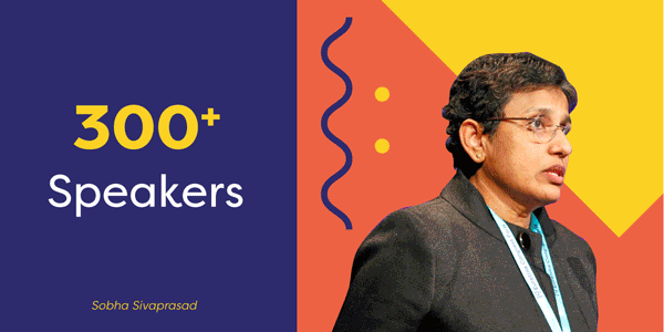
I chose a bright and complimentary colour palette to represent positivity during an uncertain time. As well as this, we chose colours that would stand out from the crowd within the web environment.

Always working with the branding to make sure the strong colour palette doesn't take away from important highlights such as keynote speakers. This was key throughout many digital marketing promotional graphics.


bottom of page