
My Top 5 Google Font Pairings you Should Consider for your Next Project

Choosing the right fonts can make or break a design project. Fonts communicate tone, improve readability, and create a visual hierarchy that guides the viewer’s eye. When fonts are paired well, they complement each other and enhance the overall aesthetic.
When selecting fonts, you want to define their purpose. Ask yourself where the font will be used: is it for headers, body text, or accents? Will the design appear in print or on a website? For example, a bold, decorative font might work well for a header but become unreadable in body text. Pairing fonts means choosing two or more typefaces that balance each other. A common approach is to combine a serif font with a sans-serif font. The contrast between the styles creates visual interest while maintaining harmony.
Why Google Fonts Are Ideal for Designers and Clients
Google Fonts provides an extensive collection of fonts that are open source and free to use. This means clients can download and install the fonts without worrying about licensing fees or subscriptions. This accessibility encourages consistency across different platforms and devices. Designers can confidently recommend Google Fonts knowing their clients will have no trouble using them later.
How to Choose the Right Fonts for Your Project
Start by defining the font’s role in your design. Headers usually require fonts that grab attention and convey the tone quickly. Body text needs to be highly readable, especially for longer passages. Consider the medium: fonts that look great on screen might not translate well to print, and vice versa.
Next, think about the personality of the fonts. A tech startup might want clean, modern sans-serifs like Roboto or Montserrat, while a literary magazine might prefer elegant serifs like Playfair Display or Merriweather. When pairing fonts, look for contrast in style but harmony in mood. For example:
Pairing a geometric sans-serif with a humanist serif can create a balanced, approachable look.
Combining a script font with a simple sans-serif can add flair without sacrificing readability.
My Top 5 Google Font Pairings for Designers
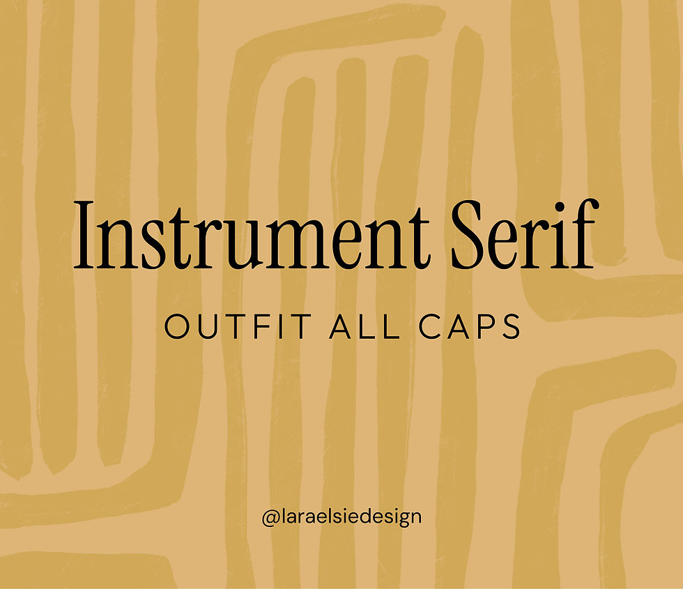
1. Instrument Serif & Outfit
Instrument Serif offers a sophisticated and condensed serif perfect for headlines without taking up too much space. Outfit either in All Caps or Title case is a clean sans-serif that compliments the serif headline and balances nicely for paragraphs and captions.

2. Albert Sans Bold & Garamond
Albert Sans is a modern geometric sans serif that works well for bold headers, while Garamond's serif style adds warmth and readability to body text. This pairing would particularly suit print projects.

3. Source Serif Pro & DM Sans
A really lovely combination - Source Serif Pro was originally designed to compliment Source Sans Pro font. It works really well for headlines in a digital environment, the letter shapes are simplified and highly readable. DM Sans is a modern, rounded sans serif font that sits nicely under Source Serif Pro for body text or subheadings.

4. Literata Regular & Urbanist
Literata is a classic serif font and a distinct variable font family for digital text. It can work well for either headlines or body text but here, I've paired it with the modern sans serif, Ubranist. The clean and simple style of the sans serif allows Literata to take centre stage as a headline.

5. Sora Bold & Inter Light
The type family Sora shows cues of low-resolution aesthetics and early screen typography giving it a nostalgic vibe, and very much on trend for digital design. I've paired it with Inter, one of the most readable fonts available and works beautifully for websites, brand guidelines, brochures and presentations.
A few Tips for Effective Font Pairing
Use no more than two or three fonts in a single project to maintain coherence.
Match x-height and stroke contrast to ensure fonts look balanced together.
Test font sizes and weights to create clear hierarchy and emphasis.
Consider colour and spacing to enhance legibility and visual appeal.
Choosing the right fonts and pairing them thoughtfully elevates your design and strengthens your message. I really love Google Fonts for client projects as they offer a reliable, cost-free resource that supports creativity and client needs. Explore these pairings and experiment with your own combinations to find what works best for your next project.

Comments